While this is visually appealing for a
text, there are typographical and graphic issues. Can you find
them? Mouse over the logo to the left to email your comments.
I’ll never turn down a free edit. AU.
P.S. The title is not set in true small
caps so the weight of the characters are not uniform, the large
cap “F” in “File” looks like it is
about to eat the small cap “i”, and the
“P” in Page seems to be in another country away
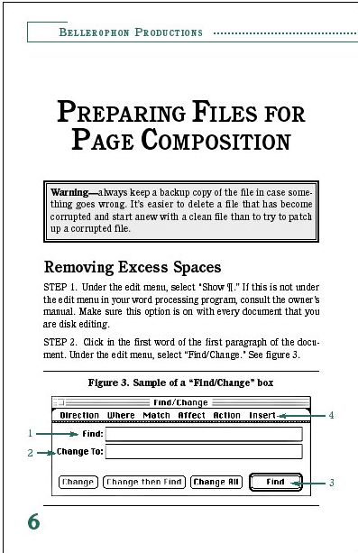
from “age” (kerning is in order). The dialog box
graphic was taken from a 72 dpi screen capture and
doesn’t have the necessary resolution to image cleanly.